Objective
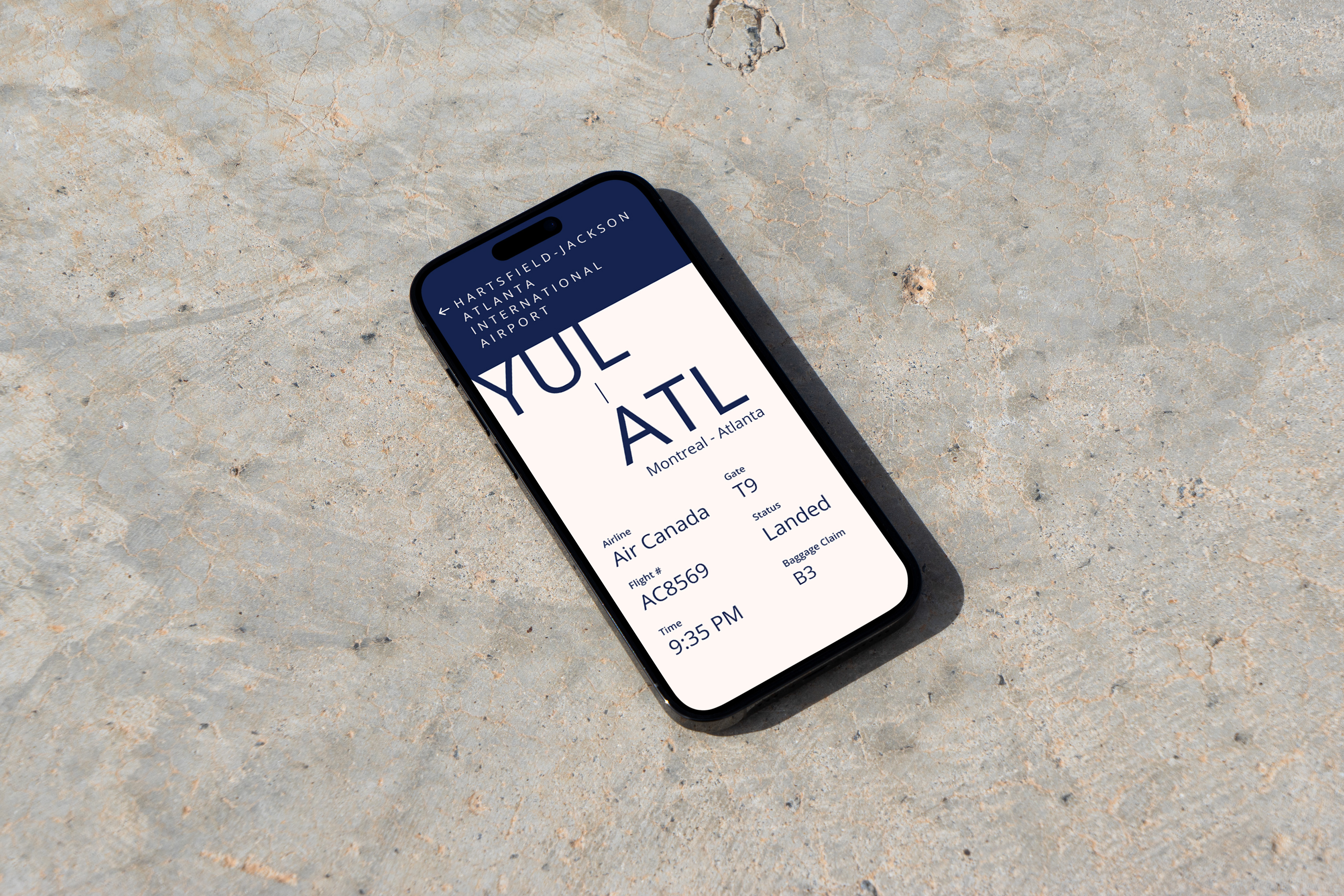
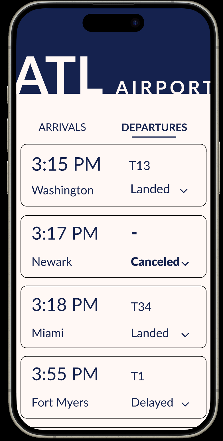
For this project, the instructions required us to design a visually understandable flight information interface. We were given a persona for all ages. We had to create a hierarchy that would help users understand the information and get where they need to be.
First Iterations
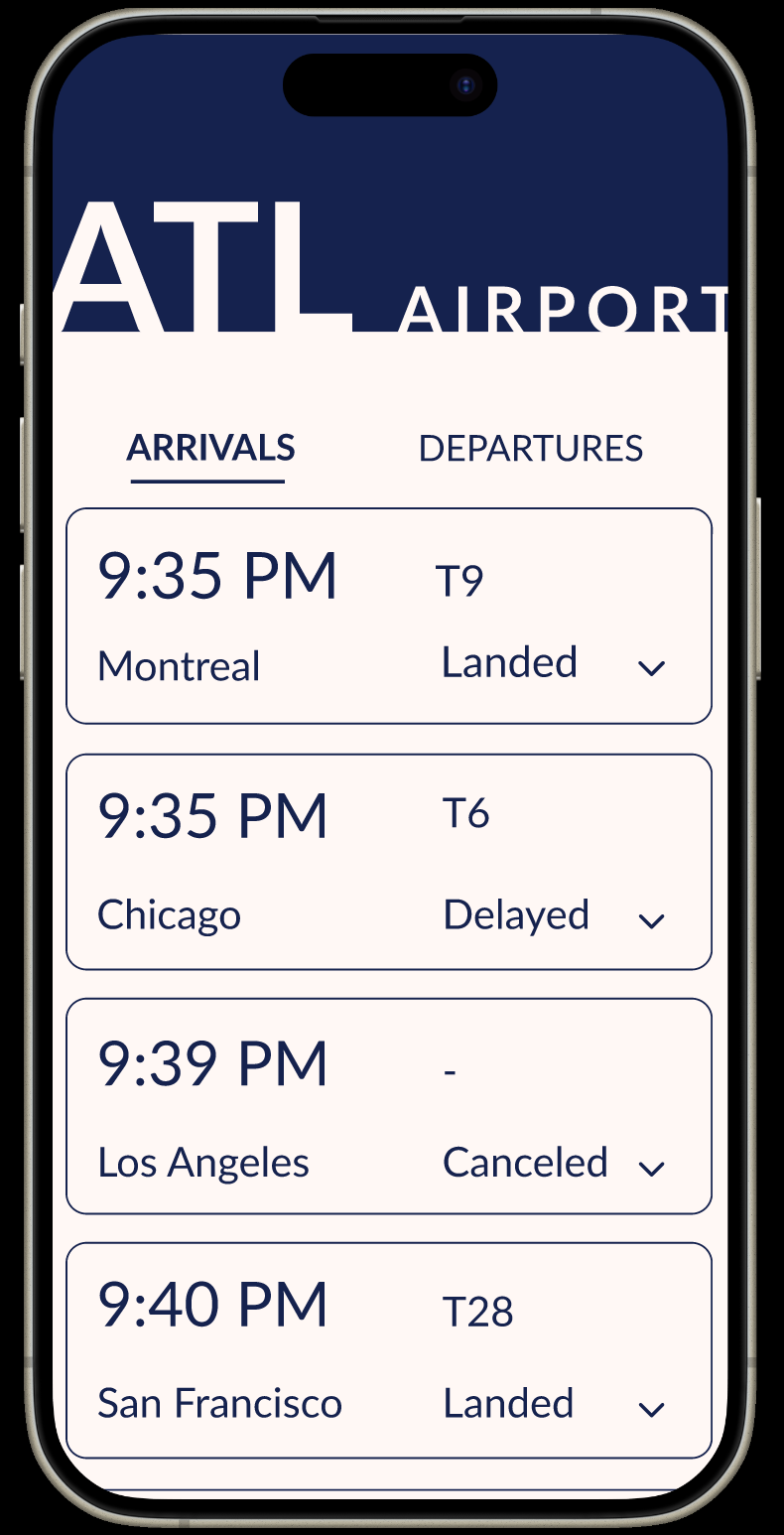
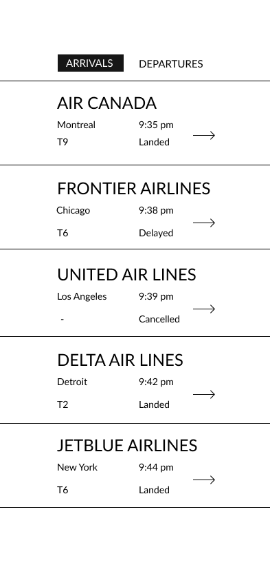
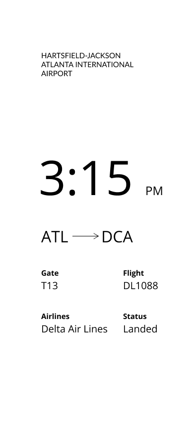
For my first iterations, I was seeing what the best hierarchy was. For the home screen, I first put the airlines as the first information the audience saw, but then noticed that the names were too long for the interface.


Adding Color
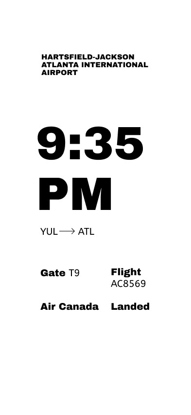
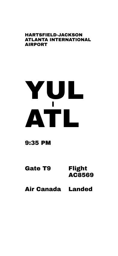
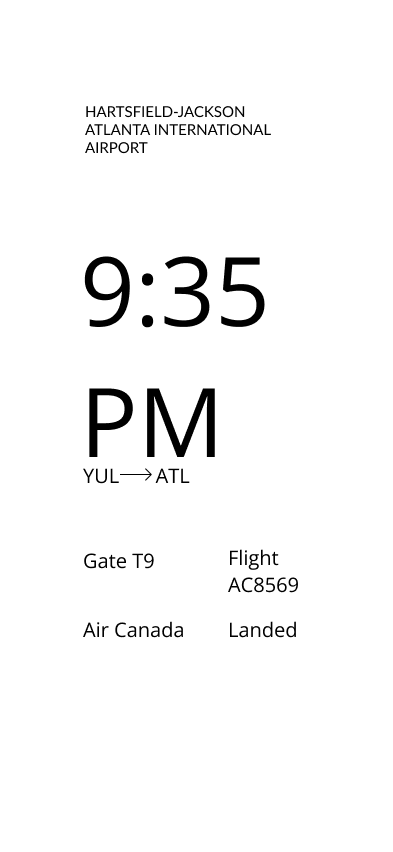
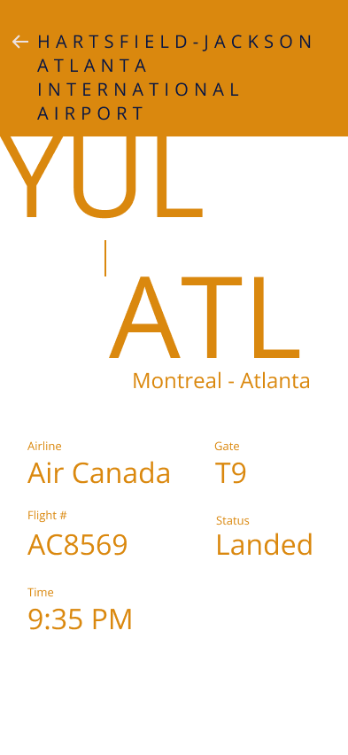
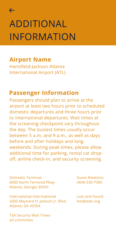
First, I tried orange text on a white background, then tried mixing orange and navy with the white background. I found that to be too much altogether, so I tried navy on a pink background, but that ended up being too much, too. I ended up just using navy text on a white background, which I found to be legible and pleasing to the eye.
Final